The right lehenga colour transforms you on camera, but what looks stunning in the mirror won't always translate to film. Discover which hues photograph beautifully, considering skin tone, fabric weight, and lighting conditions at your Indian wedding.
Why Lehenga Colours Matter in Photography
Choosing lehenga colours that photograph beautifully requires understanding how fabric, light, and the camera's lens interact differently than your eye does. The colours you see in natural sunlight, under tent lights, or in your living room will shift dramatically when captured by a camera, especially during golden hour or under professional lighting rigs. Photographers often notice that colours appearing subdued at dawn suddenly glow richly during later shots, or that a vibrant shade you loved in fabric samples looks washed out in photographs.
Your skin tone plays the most critical role in this equation, far more than trending colours or what you saw on social media. A deep emerald that would look stunning on a warm-toned south Indian bride might overwhelm a fair-complexioned north Indian bride, or vice versa. The principle is simple: colours that harmonise with your undertone—whether warm (golden/olive), cool (pink/blue), or neutral—will photograph with dimension and depth, rather than clashing with your complexion or appearing muddy.
Warm Tones That Glow on Camera
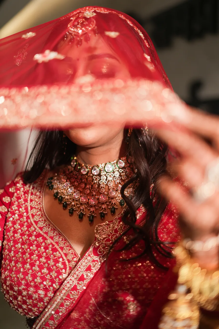
Warm lehenga colours—burgundies, deep golds, warm reds, and terracottas—photograph exceptionally well because they complement warm-toned skin and reflect light beautifully under both natural and artificial lighting. These hues are particularly forgiving during golden hour, when the setting sun bathes everything in amber tones that make warm colours sing and create those dreamy, romantic frames photographers live for. Burgundy, especially, has become a favourite amongst sophisticated Indian brides because it reads as both traditional and contemporary, and the depth of the shade photographs beautifully without appearing black in shadow areas.
Burnt orange and rust tones are underrated choices that photograph wonderfully, particularly if you're planning a wedding in autumn or during the cooler months when these warm shades feel seasonally appropriate. They pair beautifully with gold jewellery and create a luxurious, vintage aesthetic in photographs. The key is ensuring the shade isn't so muted that it disappears on camera or so bright that it becomes distracting.
Deep, Rich Jewel Tones for Impact
Jewel tones—deep sapphire, midnight blue, rich purple, and forest green—photograph with unmatchable elegance and presence on camera, making them ideal choices for brides who want their lehenga to command attention in every frame. These colours hold their depth beautifully even in shadow areas or indirectly lit spaces, and they photograph more saturated and luxurious than they might appear to the naked eye. A deep navy lehenga that looks almost black in your home will photograph as a rich, complex blue during your wedding day, particularly under professional lighting.
The richness of jewel tones also means less embellishment is needed to create visual impact; a beautifully embroidered sapphire lehenga will photograph as though it's glowing, whereas a lighter shade might need heavier embroidery to achieve the same presence. These tones work wonderfully across all skin tones, though fair-skinned brides often find deep purples and sapphires especially flattering, while warmer-toned brides can carry jewel tones with warmer undertones (like deep teal rather than cool blue).
Reds and Traditional Colours—Navigating the Camera
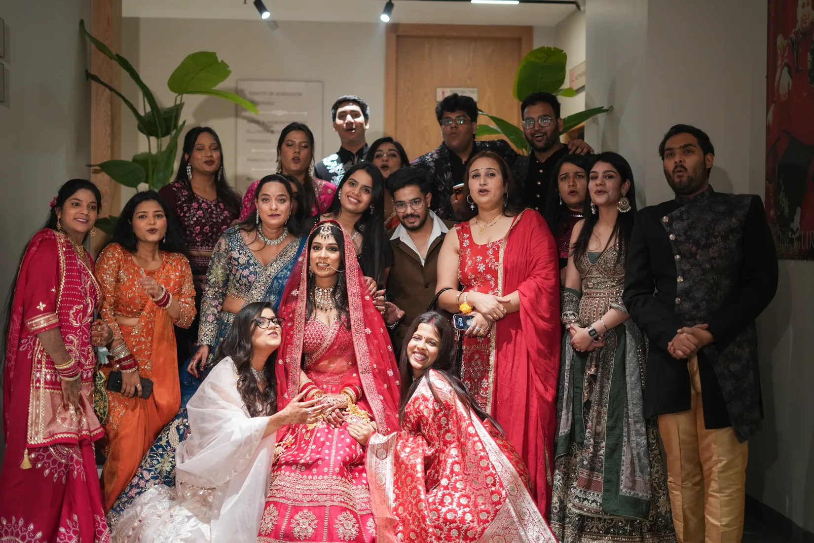
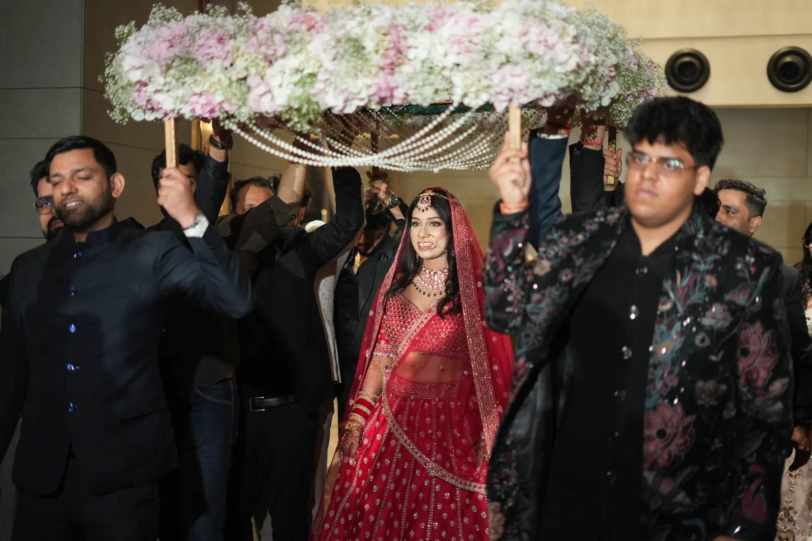
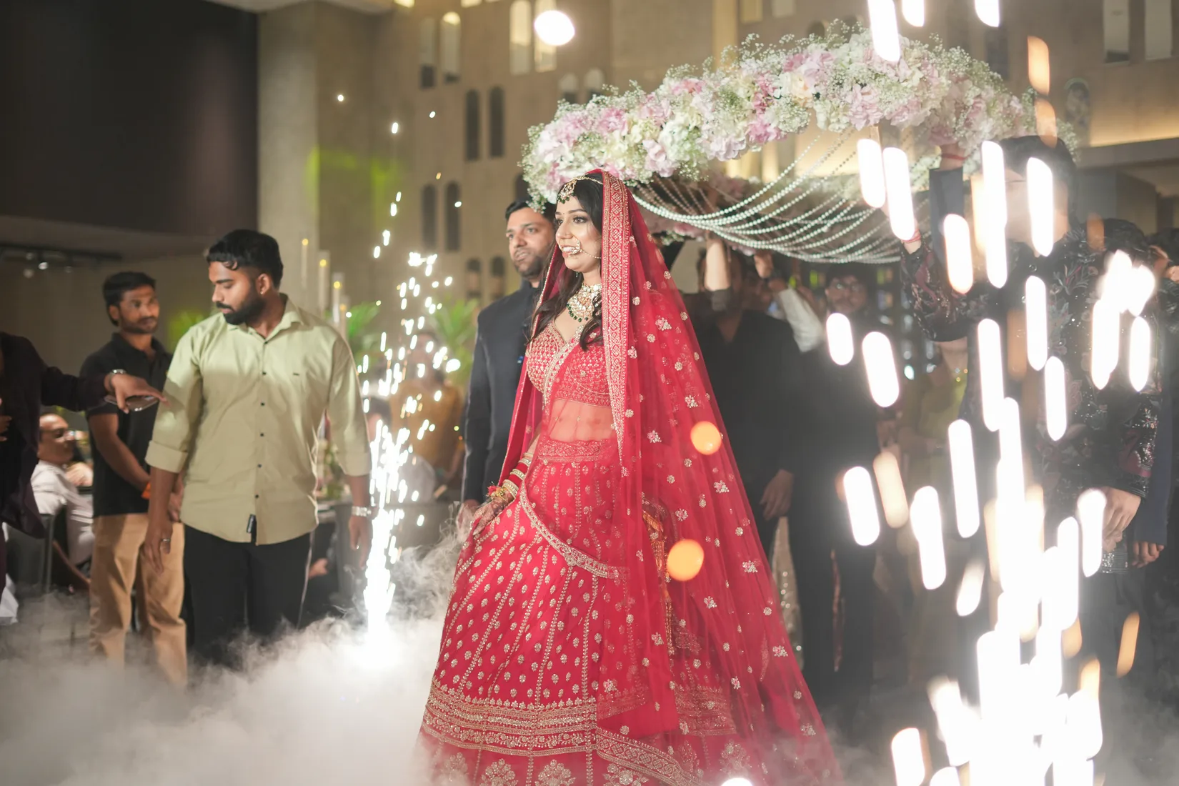
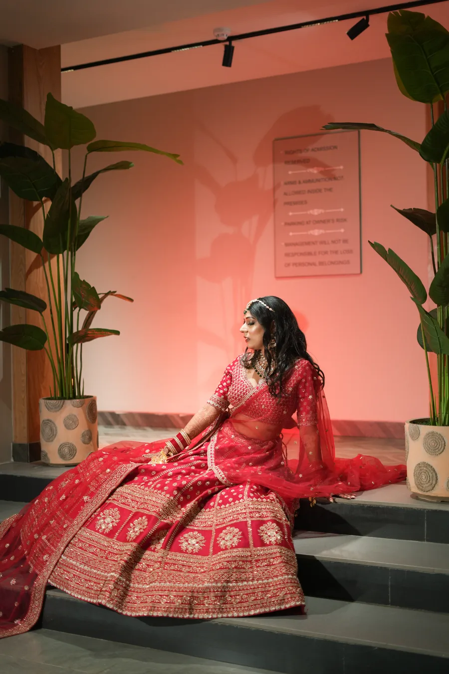
Classic bridal reds photograph differently depending on their undertone: a blue-based red (like Marathi or Bengali red) photographs as a deeper, more wine-like shade, whilst a warm true red or orange-red photographs closer to how it appears in person. Understanding this distinction helps you choose confidently; if you want your red to photograph as vivid and traditional, select fabric swatches and test them in the exact lighting conditions of your venue. The camera tends to slightly desaturate reds, so a slightly more saturated red in person will photograph as the classic bridal shade you envisioned.
Avoid extremely bright, neon-tinged reds if you want your lehenga to photograph as elegant rather than costume-like. Muted, sophisticated reds—oxblood, burgundy, and deep maroon—photograph with more complexity and luxury.
Colours to Approach with Caution
Pastels and very light shades, whilst beautiful in person, often photograph as washed-out or nearly white on camera, particularly in bright daylight or professional photography lighting. If you love pale pink, peach, or cream, ensure your lehenga has generous, detailed embroidery that creates visual depth and texture, so the photographs retain dimension and don't look like a white dress. Similarly, neon or artificially bright colours often photograph as harsh and unflattering; they read as costume-like rather than elegant in final images.
Overly bold patterns combined with overly bold colours can create visual noise in photographs. A heavily embroidered gold lehenga in a simultaneously bright red can become visually overwhelming on camera, particularly in close-up shots. Instead, consider balancing a bold colour with thoughtful embroidery placement, or a slightly more muted colour with generous detailing.
Making Your Final Colour Choice
Test your lehenga colour in the exact lighting of your venue if possible, or at minimum under the type of lighting you'll have (natural sunlight, tent lights, indoor lamps). Bring fabric swatches to your photographer or lighting designer and ask for their honest feedback on how the shade will read on camera. A good photographer can also adjust colour and warmth in editing, but beginning with a shade that photographs beautifully means your final images require less correction and look more naturally stunning.
Consider your jewellery when choosing your lehenga colour. Gold jewellery photographs warmly and can either harmonise beautifully with warm-toned lehengas or create visual richness against jewel tones. Similarly, your dupatta colour should either complement or intentionally contrast with your lehenga colour in a way that photographs as harmonious rather than chaotic. When in doubt, lean towards depth of colour rather than brightness of hue.